Statistical Data Exploration using Spark 2.0 - Part 2 : Shape of Data with Histograms
In our last blog, we discussed about generating summary data using spark. The summary works great for understanding the range of data quantitatively. But sometimes, we want to understand how the data is distributed between different range of the values. Also rather than just know the numbers, it will help a lot if we are able visualize the same. This way of exploring data is known as understanding shape of the data.
In this second blog of the series, we will be discussing how to understand the shape of the data using the histogram. You can find all other blogs in the series here.
TL;DR All code examples available on github.
Histogram
Histograms are visual representation of the shape/distribution of the data. This visual representation is heavily used in statistical data exploration.
Histogram in R
In R, histogram is part of package named ggplot2. Once you installed the package you can generate the histogram as below.
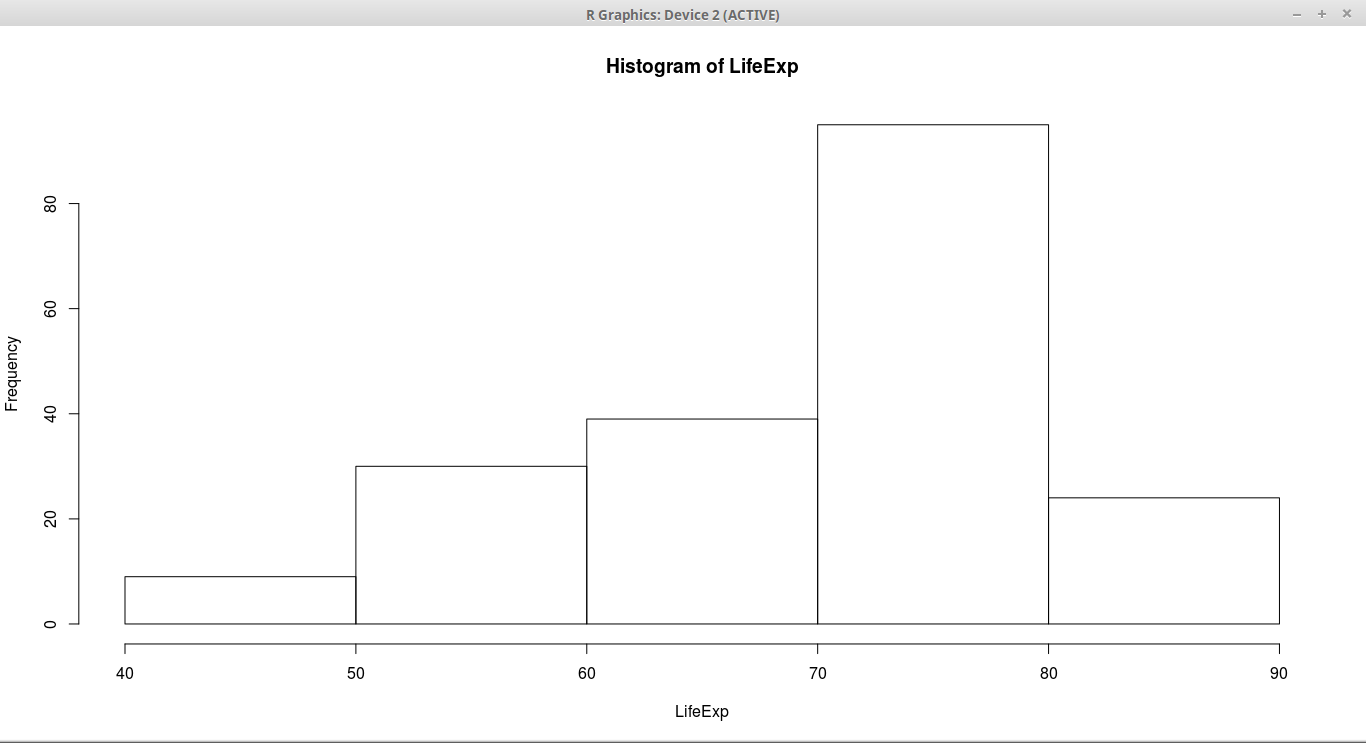
hist(LifeExp,5)We use hist method provided by the library to draw the histogram. The below picture shows the histogram.
Histogram in Spark
In order to generate the histogram, we need two different things
-
Generate the values for histogram
-
Display the visual representation
Calculating the histogram in spark is relatively easy. But unlike R, spark doesn’t come with built in visualization package. So I will be using Apache Zeppelin for generating charts.
Calculating the histogram
We will be using same dataset, life expectancy, dataset for generating our histograms. Refer to last blog for loading data into spark dataframe.
Dataframe API doesn’t have builtin function for histogram. But RDD API has. So using RDD API we can calculate histogram values as below
val (startValues,counts) = lifeExpectancyDF.select("LifeExp").map(value => value.getDouble(0)).rdd.histogram(5)RDD histogram API takes number of bins.
The result of the histogram are two arrays.
-
First array contains the starting values of each bin
-
Second array contains the count for each bin
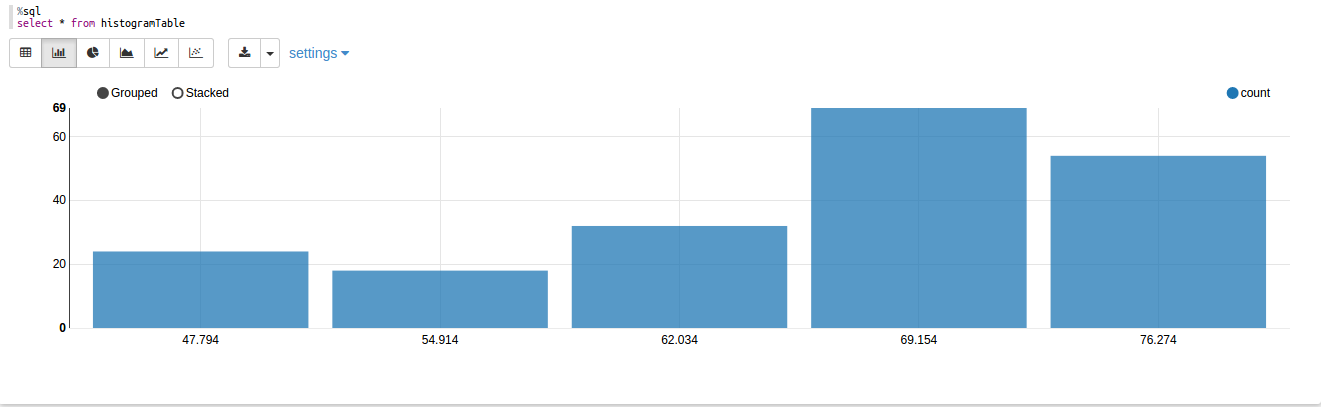
The result of the above code on our data will be as below
startValues: Array[Double] = Array(47.794, 54.914, 62.034, 69.154, 76.274, 83.394)
counts: Array[Long] = Array(24, 18, 32, 69, 54)
So the values signify that there are 24 countries between life expectancy from 47.794 to 54.914. Most countries are between 76-83.
If you don’t like using RDD API, we can add histogram function directly on Dataframe using implicits. Refer to the code on github for more details.
Visualizing the histogram
Once we have calculated values for histogram, we want to visualize same. As we discussed earlier, we will be using zeppelin notebook for same.
In zeppelin, in order to generate a graph easily we need dataframe. But in our case, we got data as arrays. So the below code will convert those arrays to dataframe which can be consumed by the zeppelin.
val zippedValues = startValues.zip(counts)
case class HistRow(startPoint:Double,count:Long)
val rowRDD = zippedValues.map( value => HistRow(value._1,value._2))
val histDf = sparkSession.createDataFrame(rowRDD)
histDf.createOrReplaceTempView("histogramTable")
In above code, first we combining both arrays using zip method. It will give us a array of tuples. Then we convert that array into a dataframe using the case class.
Once we have, dataframe ready we can run sql command and generate nice graphs as below.
You can download the complete zeppelin notebook from github and import into yours to test by yourself. Please make sure you are using Zeppelin 0.6.2 stable release.
Conclusion
Combining computing power of spark with visualization capabilities of zeppelin allows us to explore data in a way R or python does but for big data. This combination of tools make statistical data exploration on big data much easier and powerful.